Viewing the health of appliance services using the Web UI
The appliance Web UI dashboard displays the status in the Service Health Statistics Trend chart and the notification (bell) menu.
The Service Health Statistics Trend chart displays services in Healthy, Warning, Critical, and Disabled states. You can view a specific set of health metrics for a service for a past day, week, or month. The default setting is by day.
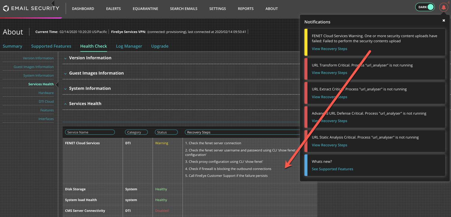
The notification bell icon at the top right corner of the Web UI dashboard displays appliance health service issues in Critical or Warning state. Notifications include links to the About > Health Check > Services Health widget.
Both the trend chart and notification bell allow you to quickly identify services that may need immediate attention.
Prerequisites
Administrator or Operator access to the Email Security - Server appliance
Scroll down to the Service Health Statistics Trend chart.
Click on a category and select one or more services to monitor. To exclude service data from the graph, click the color-coded icon in the legend.
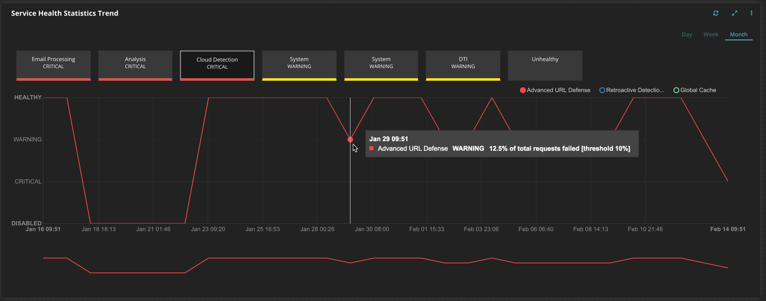
Zoom in to the timeline to identify when the service entered an unhealthy state. The example shows that only the Advanced URL Defense service is monitored and that it entered a warning state on Jan 29 at 09:51.
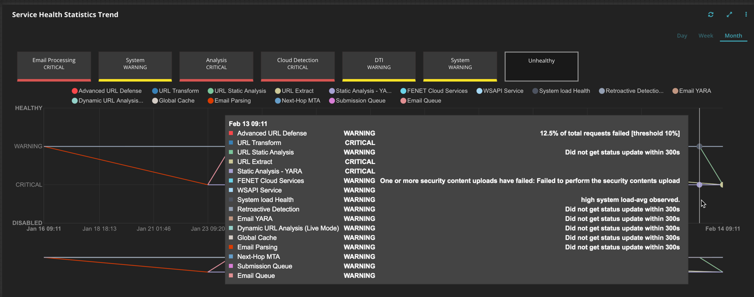
Click on the Unhealthy category to view all services that are in warning and critical states. The example below shows that several services entered critical and warning states on Feb 13 at 9:11 am.
To view degraded appliance services:
Click on the notification bell located at the top right of the Web UI dashboard.
Click on View Recovery Steps for a degraded or failed service. Severity levels are critical (red) and warning (yellow).
The View Recovery Steps link opens the About > Health Check > Services Health widget.