The dashboard's threat map is a color-coded map of the world. Countries identified as sources of suspicious emails are shaded in a color representing the relative threat. The number of suspicious emails that defines the range for a color changes dynamically according to your site's statistics.
Grey: no suspicious emails
Yellow: at least one suspicious email
Orange: moderate number of suspicious emails
Red: large number of suspicious emails
Statistics of threat activity from specific countries and unknown sources appears to the right of the map.
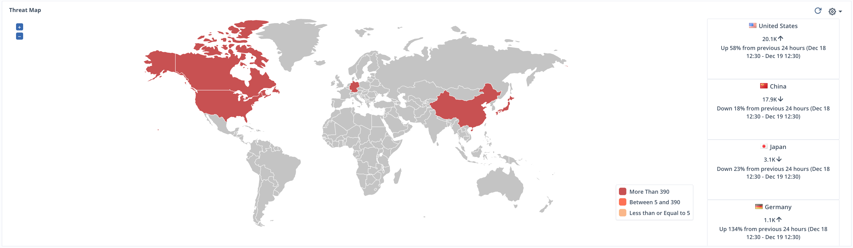
Click on the + or - buttons to zoom in or out of the threat map. You can magnify the map up to 10 times it's regular view. Click and drag on the map to adjust your view.
Note
The threat map is not available for Native domains.