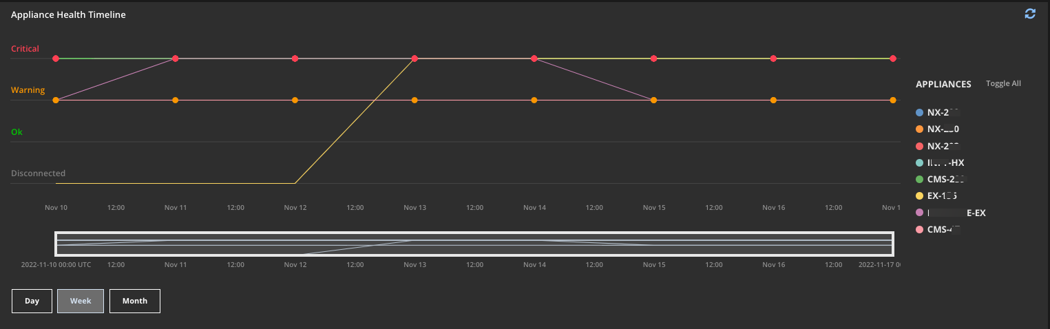
The Appliance Health Timeline widget plots the health of each appliance over a day, week, or month. The data in the timeline is aggregated hourly for the day view, and daily for the week and month views. Each point in the timeline represents the most recent occurrence of the most severe status for the appliance. The timeline represents up to ten appliances based on the highest number of critical, warning, and OK statuses in the displayed view.
You can toggle which appliances are included in the graph. Hover over or click a status point for a list of each appliance with that status at that time. Use the links in this list to pivot to the health details page for the appliance. Drag the left and right edges of the zoom chart to focus on a specific time segment.