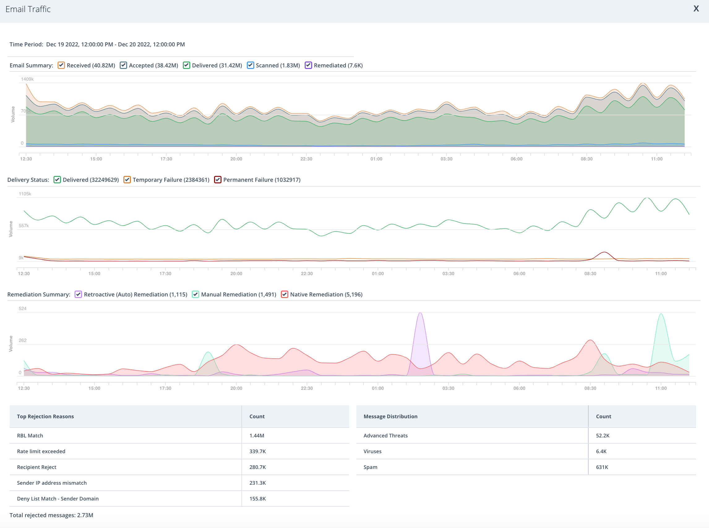
The Email Traffic widget on the dashboard displays a graph of total number of emails, broken down by Received, Accepted, Delivered, Scanned, and Remediated messages.
Expanded view
Click the  icon in the lower left corner of the widget to display more details about your organization's emails. This view shows the following:
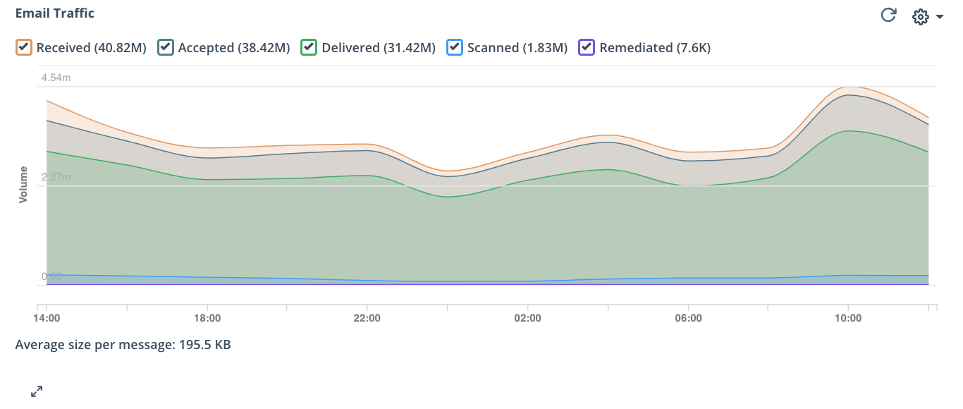
Email summary graph
The email summary graph shows all received, accepted, delivered, scanned, and remediated emails over a specific time period. You can filter what data you see by clicking on the check box next to an email status. Each email status is a different color. Received email appears in yellow, accepted mail appears in dark blue, delivered email appears in green, scanned email appears in light blue, and remediated email appears in purple.
Note
Received and Deleted messages are shown for SMTP domains only.
Scanned and remediated messages are shown for Native domains only.
Delivery status graph
The delivery status graph shows the status of outgoing mail sent over a specific time period. You can filter what data you see by clicking on the check box next to an email delivery status. Each email delivery status is a different color. Delivered email appears in green, temporarily failed email appears in orange, and permanently failed email appears in red.
Note
The delivery status graph is shown for SMTP domains only.
Remediation summary graph
The remediation summary graph shows all retroactively, manually, and natively remediated emails over a specific period of time. You can filter the data by selecting a remediation type. Each remediation type is a different color. Retroactive (auto) remediation appears in purple, manual remediation appears in green, and native remediation appears in red.
Note
Native remediation is shown for MS365 Native, MS365 Native with Hygiene, Google Workspace Native, and Google Workspace Native with Hygiene domains only.
Top rejection reasons table
The top rejection reasons table shows the top reasons why delivery of email messages to your organization was rejected. The total number of rejected messages appears below the table.
Rejection reasons include Rate limit exceeded, Recipient rejected, Deny list match, Sender IP address mismatch, Downstream MTA not responsive, Routing loop detected, Rate limit exceeded, DHAP match, SPF failure, DKIM failure, DMARC failure, and Start TLS not issued.
Message distribution table
The message distribution table shows how malicious emails over a specific period of time was organized by Email Security — Cloud.
You can hover over the graphs to see the number of emails at any particular point of time.